
A healthcare website rarely becomes unsuitable overnight. More often, the business grows around it. A clinic adds specialists, a dental practice introduces new treatments, or an independent pharmacy expands its private services. The website still looks presentable, but the work it needs to support has changed.
There may now be more clinicians, locations, appointment types, patients and enquiries, alongside extra administration and several disconnected systems. A site built for a smaller organisation can become a bottleneck without anyone making one obviously wrong decision.
The useful question is whether your website still supports the way your business operates. These seven signs can help you distinguish a few fixable points of friction from a structure that needs more substantial attention.
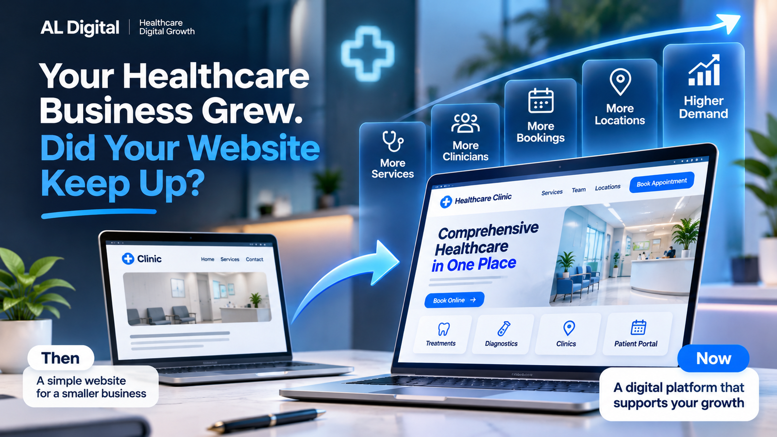
1. Your service offering has become difficult to navigate
A menu that worked for five services may struggle with twenty or thirty. Treatments, consultations, diagnostics, vaccinations, specialist appointments and packages can accumulate wherever there happens to be space. New pages get added, but the overall structure stays the same.
Patients then face long dropdowns, overlapping categories or several pages that seem to describe the same thing. A service may appear under a clinician’s name in one place and a treatment category in another. Important information becomes buried, and the correct booking route is hard to identify.
This is an information architecture problem: the way information is grouped, named and connected. The structure needs to make sense to someone choosing care, rather than simply mirroring the departments inside the business.
Start with the questions people actually ask. Can they identify the right service, understand whether it is suitable and find the next step? Give each service a clear home, use familiar labels and connect related options without duplicating whole pages.
Calls asking which appointment to choose can reveal gaps. So can enquiries arriving in the wrong inbox. Our guide to what a healthcare website should include provides a useful foundation for reviewing those routes.
2. Your team is still manually handling tasks the website should support
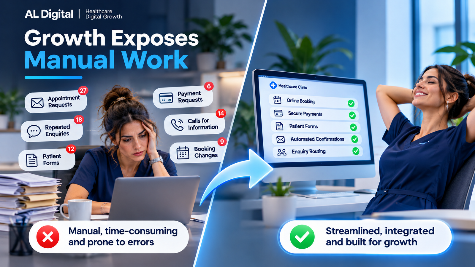
Some administration will always need a person. The warning sign is repeated work that exists because the digital journey stops too early. Appointment requests arrive through a generic email address, staff copy details into another system, and patients receive preparation instructions one message at a time.
Other examples include answering the same eligibility questions, collecting information twice, sending payment links manually, confirming routine appointments or forwarding enquiries between teams. Each workaround may feel manageable at first. Growth exposes the weakness when the same task has to happen many more times.
Map one real enquiry from arrival to completion. Record who touches it, what they copy and where they wait. That often identifies a more useful improvement than a general request for automation.
Structured forms, appropriate booking integrations, secure payment processes, automated confirmations and clear pre-appointment information can support this work. Enquiry routing can also help the right team receive the right information from the start.
Keep collection proportionate. The NHS digital service manual recommends understanding why each question is needed and removing questions whose answers have no clear use. That is a practical design principle, rather than a reason to collect an entire medical history at first contact.
Clinical judgement, sensitive communication and complex decisions need suitable human oversight. A better workflow supports the team; it does not indiscriminately automate every interaction.
3. Your booking journey has become more complicated as the business grows
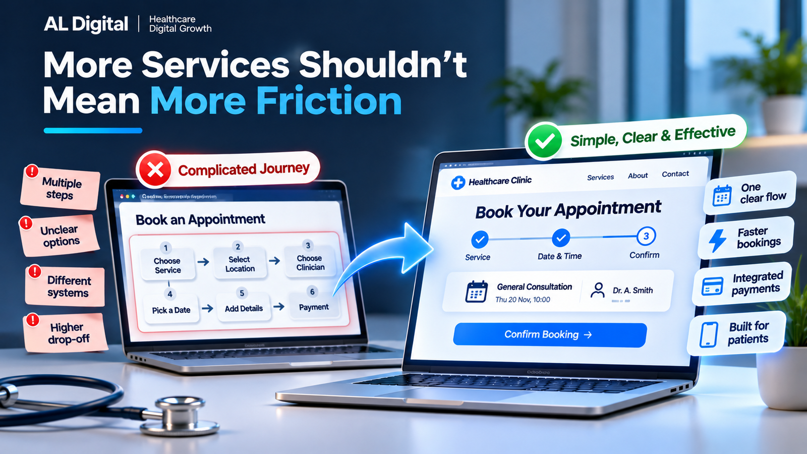
More choice creates more decisions. Different practitioners may offer different appointment lengths, locations, eligibility criteria, deposits and payment arrangements. Follow-up appointments may use another route entirely. Adding each service separately can leave patients navigating a collection of systems.
Typical symptoms include jumping between platforms, unclear appointment names, repeating a service selection after leaving its page, or having to telephone to finish what appeared to be an online booking. Patients may also be unsure whether submitting a form has reserved an appointment or merely requested one.
Review the whole route from the service page to the confirmation. Carry context forward where possible. Explain meaningful choices in plain language, show the relevant location and practitioner, and make charges and next steps clear before completion.
Simple does not necessarily mean fewer screens. A short journey with ambiguous choices can be harder than several clear steps. Nor should every service offer instant booking: assessment, triage or a referral may be necessary. Explain that route honestly.
The website and booking system should feel like one coherent patient journey. Our guide to improving healthcare online booking journeys explores how to assess the handover between them.
4. Your website no longer reflects the business patients are actually visiting
The organisation patients encounter may be more established, more specialised or more accessible than its website suggests. Older services dominate the homepage, new ones barely appear, clinician profiles are incomplete and photographs show a previous version of the premises.
New locations may have been squeezed into a contact page without their own opening hours, directions or service information. A site originally written for one practitioner may still speak as though there is no wider team.
This mismatch creates avoidable uncertainty. Someone checking a clinician or appointment location should find consistent, current information. A polished appearance cannot compensate for details that contradict an appointment email or the experience at reception.
Compare the site with today’s organisation: services, team, locations, hours, patient routes and the language used to explain them. Assign responsibility for reviewing each area. Where it helps, use the private clinic website guide to check the information patients need before choosing care.
The aim is accurate representation, not making the business appear bigger than it is.
5. Mobile patients have to work too hard
A layout that shrinks onto a phone is only the starting point. The real test is whether someone can complete the task comfortably: understand a service, find a price, call reception, get directions or finish a booking.
Small links, crowded menus and persistent popups can interrupt that route. Forms may use awkward controls, error messages may be difficult to find, and a booking widget that works on desktop may require sideways scrolling on a phone.
Try the journey yourself on a real device, including the third-party screens. Check readable text, clear calls to action, tap-to-call links, opening hours, maps and loading behaviour. Test whether details survive an error and whether a confirmation explains what happens next.
People may be travelling, working or arranging care between other responsibilities. They may also be worried about a health issue. Clear language and predictable steps matter in those circumstances.
Ask a few people unfamiliar with the site to find and request a specific service. Observe where they hesitate without coaching them. The principles in our guide to healthcare websites losing enquiries help connect these small obstacles to the wider patient experience.
6. You cannot clearly tell where enquiries are coming from
“We seem to get enquiries through the website” becomes less useful as services and marketing activity grow. You need enough visibility to understand which channels, pages and patient routes contribute useful enquiries or completed bookings.
A measurement plan might include GA4 events for key actions, enquiry submissions and booking conversions, where the systems support them. Distinguish someone clicking a booking button from someone completing an appointment. These are different stages, and counting both as the same outcome can obscure what is happening.
Connect the questions to decisions. Which landing pages attract relevant visitors? What happens after traffic from search, LinkedIn or paid campaigns arrives? Where do people leave, and which enquiries are appropriate for the services offered?
Attribution is imperfect. Consent choices, cross-domain journeys and offline conversations can leave gaps. Interpret analytics alongside reception feedback and the quality of actual enquiries, rather than treating a dashboard as a complete account.
Plan measurement around appropriate privacy and consent arrangements. Do not send patient names, symptoms or form answers into general marketing analytics. The question is what you need to learn about the journey, not how much information you can collect.
7. Making small website changes has become surprisingly difficult
Adding a service should not require a series of fragile workarounds. Warning signs include navigation breaking when pages are added, inconsistent layouts, difficult location updates, plugin conflicts and routine content changes that always require a developer.
Over time, temporary fixes become technical debt: past shortcuts that make future changes harder. Content debt works similarly. Duplicated descriptions, outdated pages and inconsistent naming all increase the effort of keeping information accurate.
Ask what makes the next sensible change difficult. Is it an unclear publishing process, missing reusable page templates, too many plugins, or an underlying platform limitation? Those causes call for different responses.
Give the team a dependable way to update common details and establish who approves clinical content. Document important integrations and test changes in an appropriate environment. A maintainable site should make routine improvements less intimidating.
Difficulty updating does not automatically justify a complete healthcare website redesign. It does justify looking at whether the present structure can support the next stage of the business.
Does outgrowing your website mean you need a completely new one?
Not necessarily. Start by identifying the constraints and comparing the effort of removing them. A new visual design alone will not solve disconnected systems or an unclear operating process.
1. Optimise a healthy foundation
If the platform and structure are sound, focus on specific improvements: clearer service pages, better calls to action, shorter forms, more useful confirmations and a stronger mobile booking experience. Fix the observed problem and check whether the change helps.
2. Restructure the patient journey
The technology may work well while navigation, locations and content have become disorganised. Restructuring can bring services into sensible groups, clarify page hierarchy and create consistent routes to booking. Plan redirects carefully when moving existing pages so established links remain useful.
3. Rebuild where the constraints justify it
A rebuild becomes more relevant when the platform, architecture, performance, integration options or maintainability prevent the business operating effectively. Define those requirements first so the replacement resolves them rather than reproducing the same problems.
AL Digital does not assume every review should lead to a new website. Targeted improvements may be the smarter investment. The decision should follow evidence about patients, staff and the systems involved.
Has your healthcare business outgrown its website?
Use this checklist with the people who handle enquiries and appointments. Discuss real examples rather than marking a box because a problem might exist.
- Patients struggle to identify the correct service.
- Staff regularly answer questions already covered online.
- Booking involves unnecessary manual steps.
- New services are difficult to add cleanly.
- Multiple systems make the journey confusing.
- Mobile booking or forms are frustrating.
- The website no longer reflects the size of the business.
- You cannot confidently identify where enquiries originate.
- Updating basic content has become difficult.
- Your team works around the website instead of the website supporting the team.
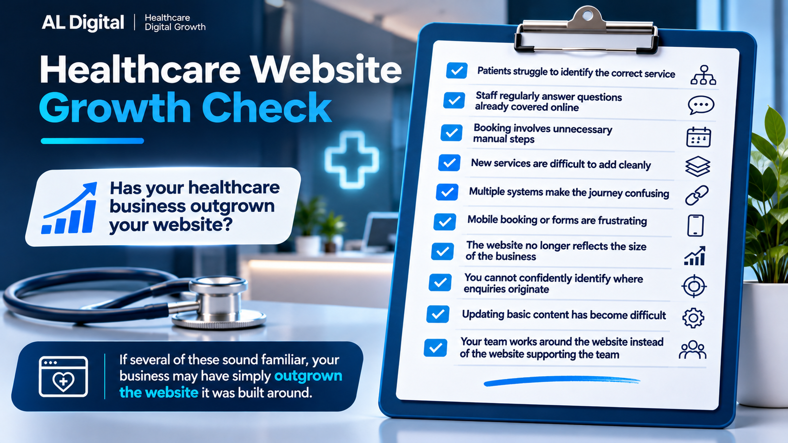
If several of these sound familiar, the problem may not be that your website is badly designed. The business may simply have outgrown the system it was originally built around.
Make the next improvement fit the business
A healthcare website sits between marketing, operations and patient experience. Service information, bookings, forms, payments and follow-up need to work together, with clear ownership whenever a person needs to take over.
Choose one priority journey and examine it from beginning to end. Combine patient feedback, staff experience and available data. Then decide whether to optimise, restructure or rebuild. Our article on why good healthcare websites still fail to convert patients looks further at the gap between a professional appearance and a useful complete journey.
Has your digital setup kept pace?
If your healthcare business has grown but your website and digital processes have not grown with it, AL Digital can help you identify where the friction is and what actually needs changing.
Explore healthcare support