
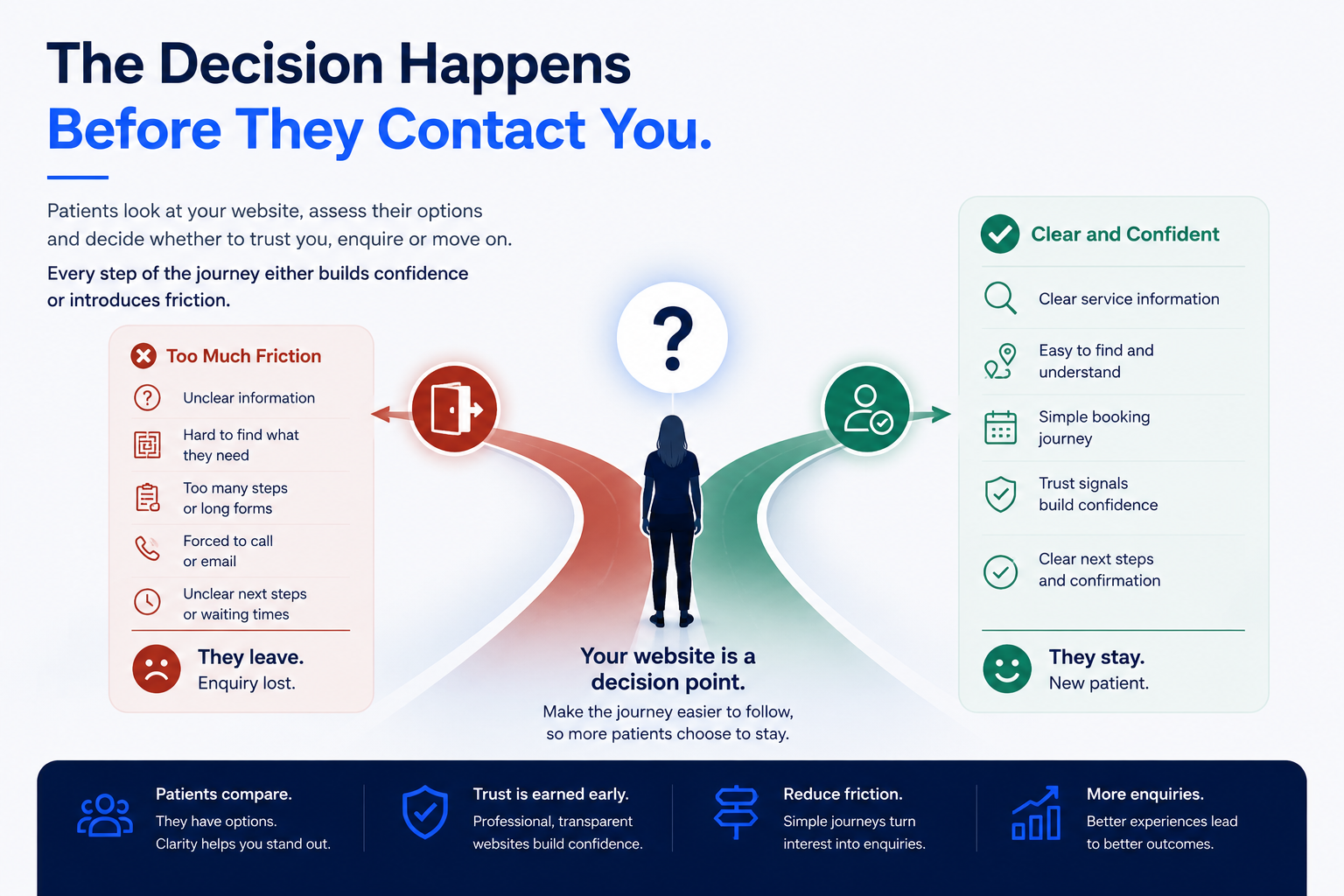
Healthcare businesses often focus on what happens after someone makes an enquiry. But an important part of the decision happens before that point.
A potential patient may visit the website, compare several services, look at practitioner information, check pricing, assess whether they trust the provider and decide whether taking the next step feels straightforward.
If the website creates too much uncertainty or effort, the business may never know that person was interested. There is no abandoned enquiry form to follow up, no missed call and no email. The patient simply leaves.
That is why improving a healthcare website is not only about making the final enquiry form work. It is about reducing friction throughout the complete decision journey.
Patients Are Making Decisions Before They Contact You
Before contacting a healthcare provider, patients may already be asking themselves:
- Is this the right service for me?
- Do I understand what happens?
- Can I trust this provider?
- How much does it cost?
- Can I book easily?
- Do I need to call?
- What happens after I submit this form?
- Is there another provider that makes this easier?
The website therefore acts as part of the decision-making process. Every unclear step can introduce hesitation, while every clear step can help build confidence.
1. Unclear Service Information Creates Hesitation
Patients should be able to understand what a healthcare service actually provides. Problems occur when:
- service descriptions are vague
- important information is spread across several pages
- terminology is overly technical
- eligibility is unclear
- patients cannot tell which service applies to them
- the expected appointment process is missing
A strong service page should usually explain what the service is, who it is for, what happens, relevant eligibility considerations, pricing where appropriate and what the patient should do next.
The objective is not to overwhelm visitors with information. It is to answer the questions most likely to prevent someone from taking the next step. Our guide to what a healthcare website should include covers the wider content, trust and functionality foundations.
2. Patients Cannot Find the Next Step
Sometimes the information itself is reasonable, but the patient does not know what to do afterwards.
- no clear booking button
- contact information buried in the footer
- several competing calls to action
- vague labels such as “Learn More”
- booking options appearing only on certain pages
- service pages ending without a meaningful action
Once someone understands the service, the next action should normally be obvious. Depending on the service, this could be Book Appointment, Check Availability, Start Consultation, Request an Appointment or Contact the Clinic.
The call to action should reflect what genuinely happens next. This principle also sits at the heart of a clearer website customer journey.
3. Too Many Steps Reduce Momentum
A patient may begin with strong intent but gradually lose momentum if the journey becomes complicated.
Service page → contact page → form → external platform → another form → email confirmation
Every additional step should have a genuine purpose. Complexity may be clinically necessary in healthcare, but unnecessary complexity should be removed.
Review whether patients are entering the same information twice, being redirected unnecessarily, completing long forms too early, moving through several disconnected systems or being asked to contact the business manually when a simpler route exists.
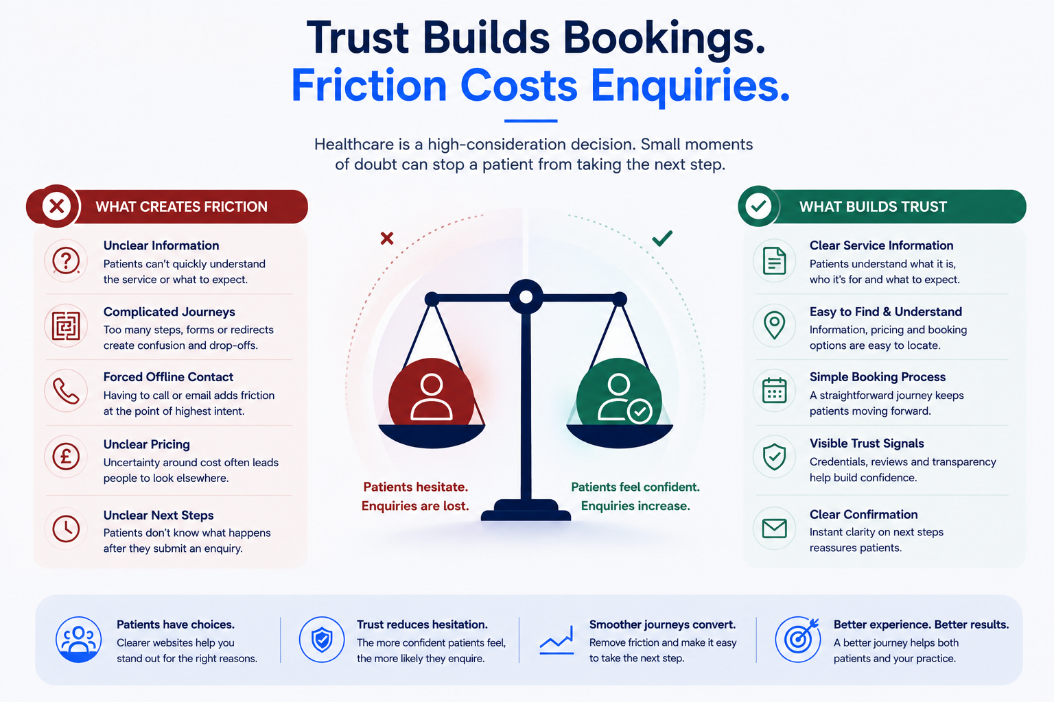
4. Forcing Offline Contact Can Create Friction
Phone and email remain important communication channels, but they should not automatically be the only route for every service.
For a high-intent patient, instructions such as “Call us to book” or “Email for more information” introduce another task into the journey. This matters particularly when the patient is browsing outside opening hours, during work, on mobile or while comparing several healthcare providers.
Where appropriate, consider offering a clearer digital route alongside phone and email. This could include appointment booking, consultation requests, availability checks or structured enquiry forms. The correct solution depends on the clinical service.
5. Long or Poorly Timed Forms Can Cause Drop-Off
Healthcare businesses genuinely need to collect important information. The issue is not simply whether a form is long. The question is:
Is this information necessary at this stage of the journey?
A patient making an initial enquiry may not need to complete the same level of information required before treatment. Where clinically and operationally appropriate, separate initial interest from detailed patient information.
This can make the first step feel more proportionate while still allowing the business to collect necessary information later. Never remove information required for clinical, legal, privacy or regulatory reasons.
6. Lack of Pricing Clarity Can Create Uncertainty
For private healthcare, patients often want some understanding of cost before making contact. Not every healthcare service can display one fixed price.
However, where appropriate, websites can communicate the consultation price, treatment price, starting price, deposit requirements, whether further costs may apply and whether pricing depends on assessment.
If pricing varies, explain why. Forcing a patient to enquire simply to discover basic pricing information can introduce unnecessary uncertainty.
7. Trust Signals Matter More in Healthcare
Healthcare decisions involve a higher level of trust than many ordinary purchases. Patients may be considering their health, personal information, treatment outcomes and significant financial commitments.
Useful trust signals may include practitioner profiles, qualifications, professional registrations where relevant, clear business and contact information, clinic location, transparent pricing, patient information, privacy information, consistent branding, secure payment experiences and genuine reviews where appropriately used.
The objective is not to fill every page with badges. Trust should feel built into the overall experience. See how AL Digital approaches healthcare digital solutions around real patient journeys and business requirements.
8. Poor External Handoffs Can Break Continuity
Many healthcare businesses use third-party systems for booking, payments, consultations, forms and patient management. These systems are not inherently a problem. The problem occurs when the patient feels they have suddenly left the healthcare provider’s journey.
Service page → unfamiliar third-party domain → different design → separate form → another payment page
Where external platforms are required, clearly explain what will happen, maintain consistency where possible, avoid duplicate information requests, reassure the patient that they are in the correct place and provide clear confirmation afterwards.
Our guide to improving online booking journeys for healthcare businesses looks at this connected experience in more detail.
9. Mobile Friction Can Lose High-Intent Visitors
Many healthcare searches happen on mobile. Review the complete journey from a phone rather than only checking whether the site technically responds to a smaller screen.
- Can patients read the service information comfortably?
- Are buttons easy to tap?
- Are forms easy to complete?
- Is pricing visible?
- Are telephone numbers clickable?
- Does the booking system work properly?
- Are external platforms mobile-friendly?
- Is confirmation clear?
A website can be technically mobile-responsive while still providing a poor mobile journey.
10. Weak Confirmation Creates Uncertainty
Patients need to know what happened after they took action. A generic “Thank you for your submission” may not provide enough information.
Depending on the process, explain whether the appointment is confirmed, whether the request is awaiting review, when someone will respond, whether payment succeeded, whether another form is required, where the appointment takes place and what the patient should prepare.
Clarity after the enquiry is part of the overall experience.
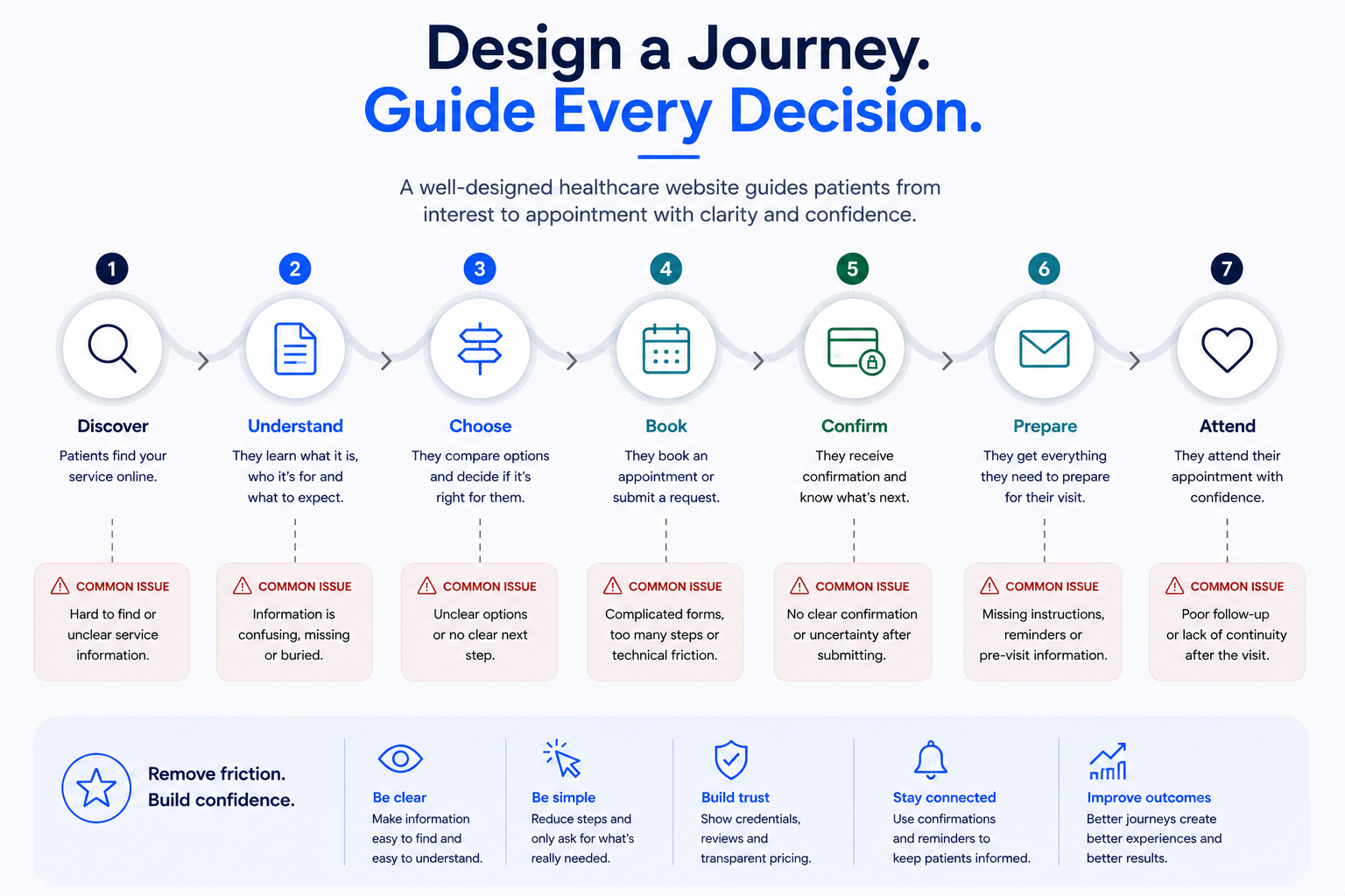
Design the Whole Patient Journey
Healthcare websites work better when the journey is considered as a connected sequence rather than a collection of independent pages.
Discover
Can patients find the relevant service?
Understand
Can they quickly understand what it is and who it is for?
Choose
Can they decide whether this provider and service are appropriate?
Book
Is the next step easy and proportionate?
Confirm
Do they know exactly what has happened?
Prepare
Do they receive the information needed before the appointment?
Attend
Does the digital experience connect smoothly with the actual service?
How to Diagnose Where Enquiries Are Being Lost
Do not rely only on assumptions. Combine several useful sources of evidence.
Analytics
Review service page traffic, CTA clicks, enquiry starts and completions, booking starts and completions, mobile versus desktop behaviour and traffic sources.
Behaviour tools
Microsoft Clarity or a similar tool can help identify dead clicks, rage clicks, excessive scrolling, abandonment patterns and confusing interactions.
Customer feedback
Listen to repeated questions, reception or admin feedback, booking problems, patient confusion and enquiries that arrive through the wrong channel.
Manual journey testing
Go through the process yourself from Google or search → service page → enquiry or booking → confirmation. Test it on desktop and mobile.
The goal is to identify patterns rather than overreact to one isolated user. Our broader guide on why business websites do not generate enquiries covers other common commercial friction points.
Healthcare Website Enquiry Checklist
Before redesigning an entire healthcare website, reviewing the existing patient journey can reveal relatively small issues that are worth fixing first.
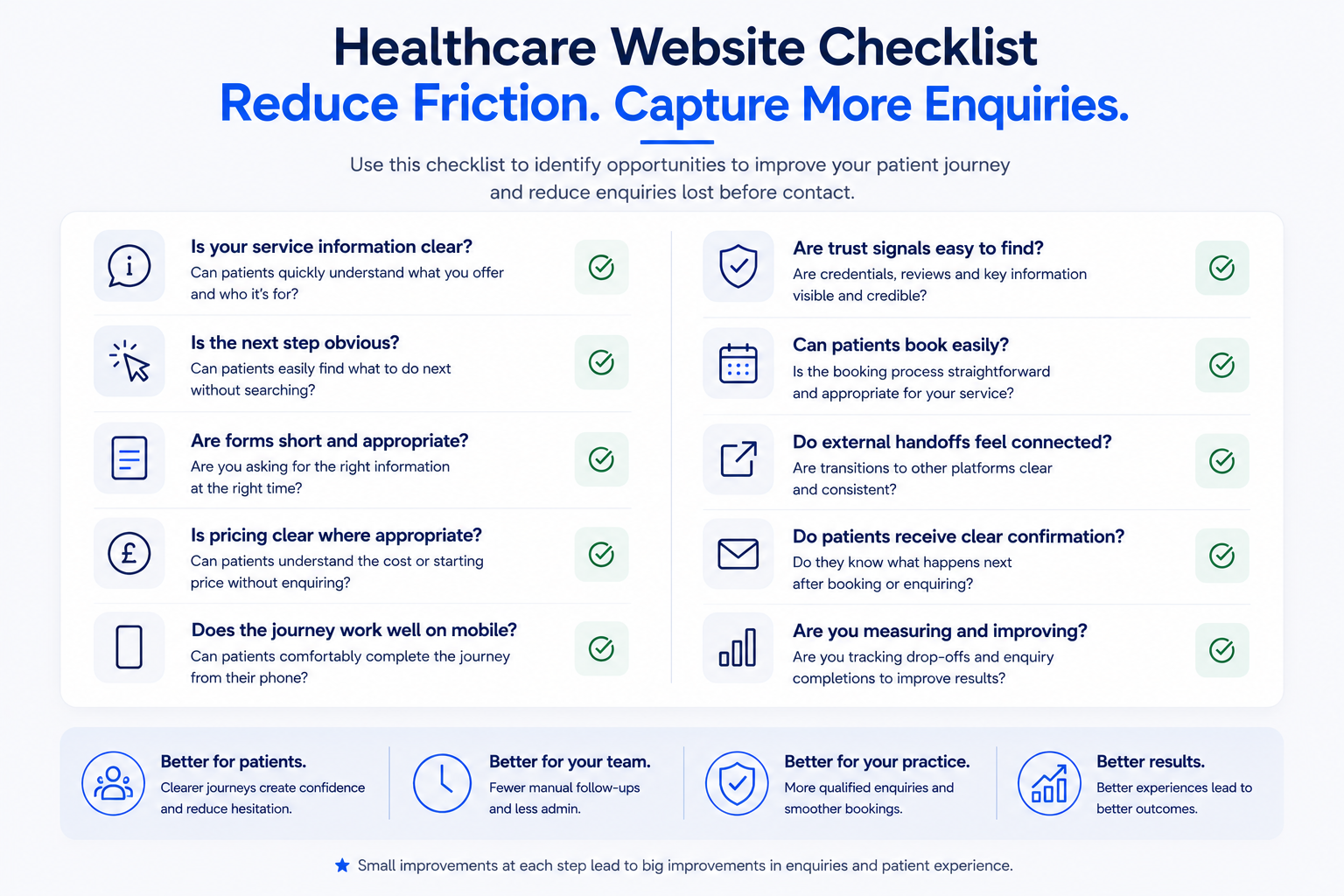
Check service clarity, CTA clarity, form appropriateness, pricing transparency, mobile experience, trust signals, ease of booking, external handoffs, confirmation and measurement.
Small improvements at several stages can create a much clearer overall experience.
Do You Need a New Website?
Not necessarily. If the technical foundation is strong, the business may only need to improve service pages, navigation, CTAs, forms, booking flows, pricing information, trust signals, mobile usability or integrations.
A complete rebuild becomes more relevant when the underlying technology or structure prevents these improvements from being implemented effectively. Read Website Redesign vs New Website: Which Do You Actually Need? for a practical comparison.
The Goal Is Confidence, Not Complexity
Healthcare websites do not need to impress visitors with unnecessary complexity. They need to help patients make informed decisions with confidence.
Clear information → clear decision → clear next step
The easier the journey is to understand, the less opportunity there is for unnecessary uncertainty to interrupt it.
Explore AL Digital’s wider digital services, view selected case studies or return to the Insights hub for more practical guidance.
Not sure where your healthcare website may be losing enquiries?
AL Digital builds websites and connected digital systems around real patient journeys — from service discovery and enquiries through to bookings, payments and follow-up.
Explore Healthcare Solutions Get a Free Quote