
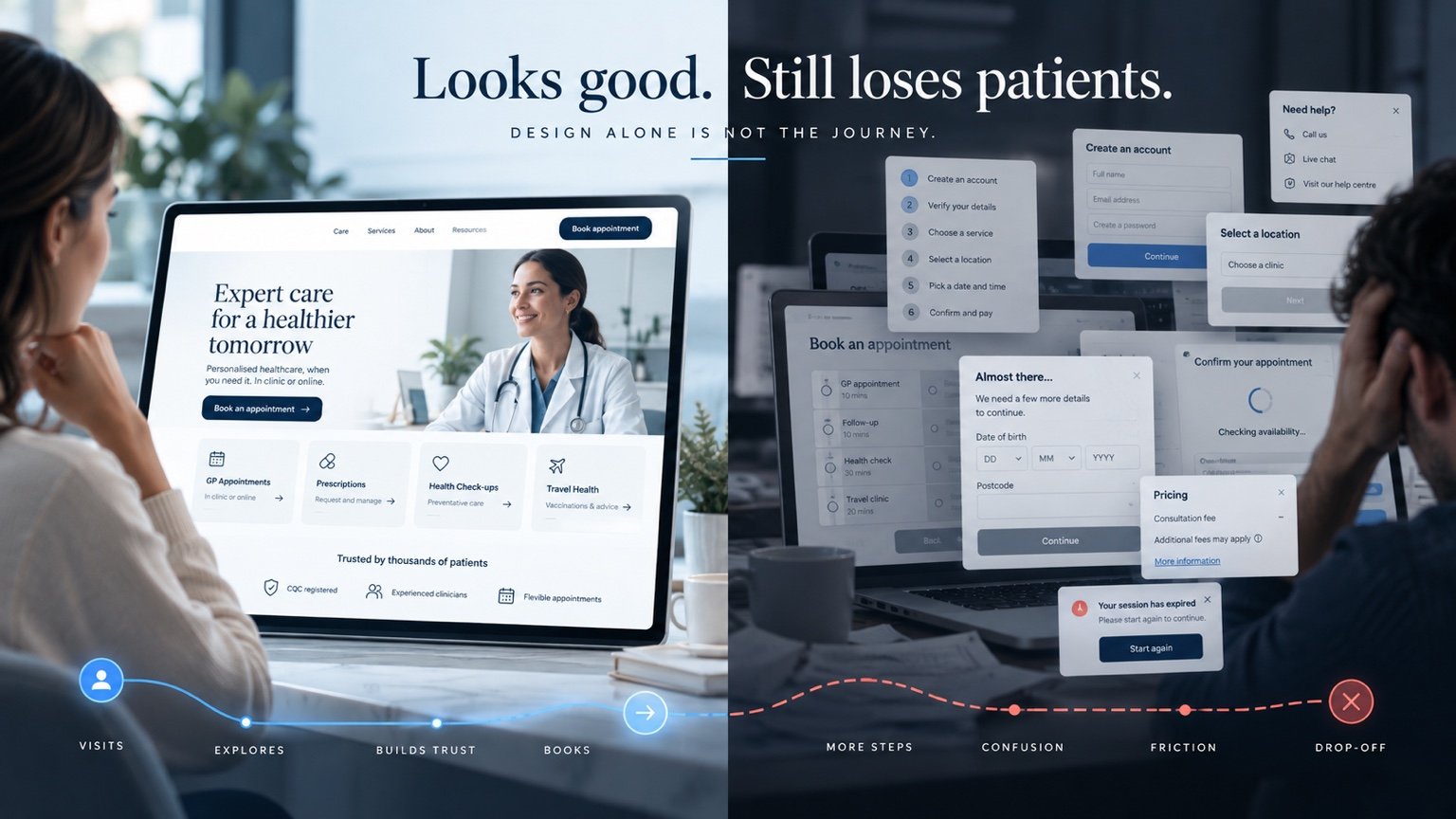
A healthcare website can look modern, professional and trustworthy at first glance and still lose prospective patients before they book or make contact.
The homepage may be polished, the photography carefully chosen and the branding consistent. Yet somebody looking for a particular service can still reach a dead end: an unclear fee, an unfamiliar booking platform or a form that asks for more information than they feel ready to share.
Looking good and helping somebody confidently complete the next step are different jobs. The commercial question is whether the whole experience supports appropriate bookings, enquiries and consultations. In healthcare, success also means helping someone recognise when a service is unsuitable and find the correct route.
Start with the journey: Can someone identify the service, understand their options, establish trust and complete the appropriate next step without avoidable uncertainty?
1. Good design does not automatically mean good conversion
Visual quality matters, but it cannot explain a confusing service or repair a disconnected booking process. A beautifully designed page may still use unfamiliar terminology, hide the relevant appointment type or leave visitors unsure whether they should book, enquire or telephone.
It is useful to separate presentation from task completion. Walk through one specific route, such as a new patient researching an initial consultation. Check what they must understand before acting and whether each screen supplies it. Do not judge the experience only from the homepage.
A weak point may sit beyond the website itself: a booking provider, payment step or team inbox. Our guide to what a healthcare website should include sets out the wider foundation. The next task is checking whether those parts work together.
2. Patients need to understand the service before they can act
Service pages should answer practical questions rather than rely on broad promises about excellent care. Someone comparing options needs to know what is offered and whether the next step is appropriate for them.
- Use a recognisable service name, explaining specialist terminology.
- Describe who the service is for and relevant eligibility or referral requirements.
- Explain what happens during the appointment and who provides it.
- Show location or remote-consultation arrangements, fees where appropriate and a clear next step.
For example, “Specialist services” tells a visitor less than a clearly explained consultation page. An illustrative service page could distinguish a first appointment from a follow-up and explain when the team needs to review a request. The provider should approve clinical and eligibility information; design should make that information understandable.
3. Trust has to be established before the booking decision
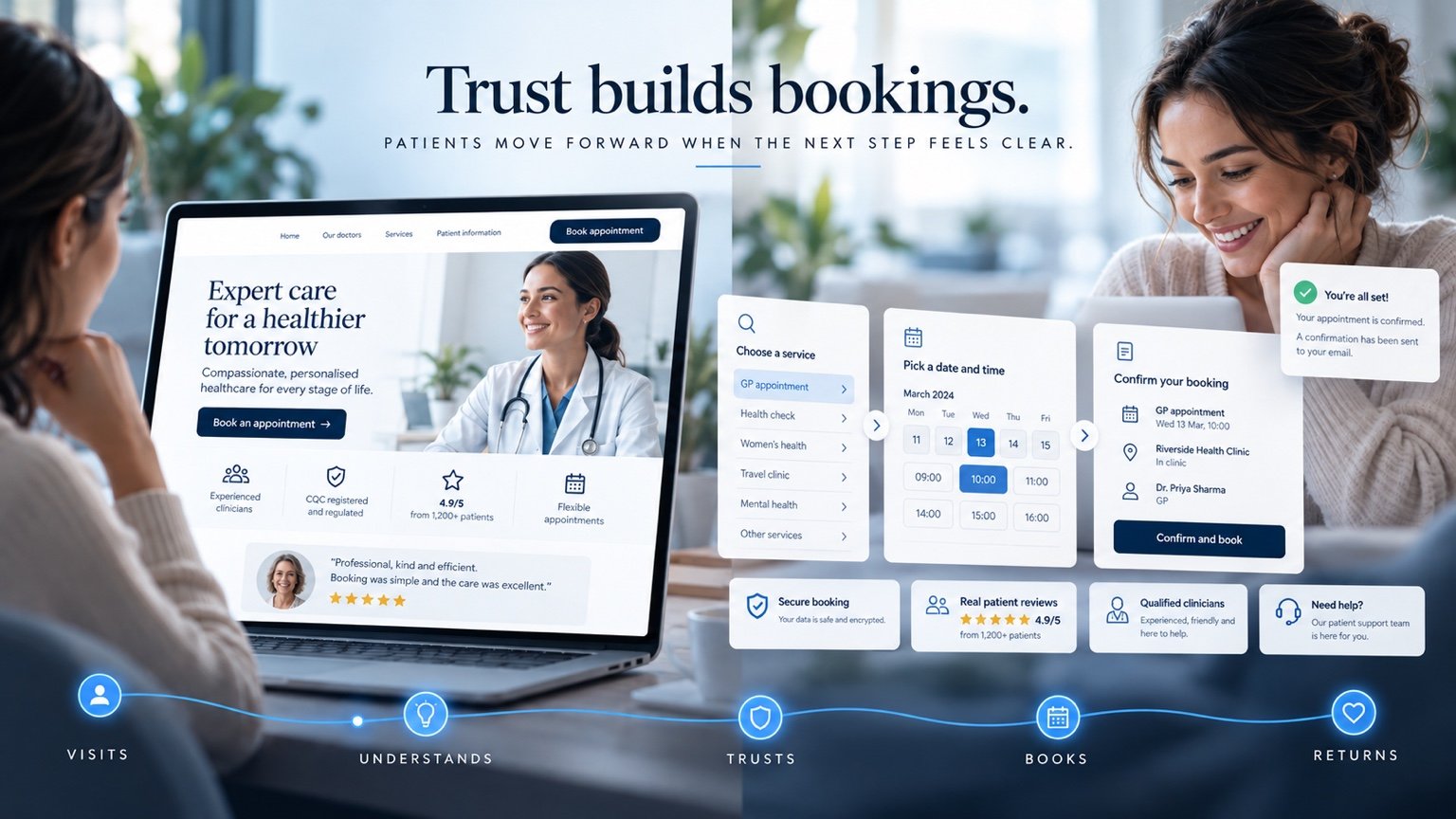
Trust is built from details people can check: clinician names and roles, appropriate professional credentials, genuine reviews where suitable, a physical location, working contact details and clear expectations. These should appear where a decision is being made, rather than only on a separate About page.
Regulatory information depends on the provider, service and jurisdiction. CQC regulates relevant health and social care services in England; its service search lets people check published reports and ratings. That does not mean every UK healthcare business has the same registration or display requirements.
Explain privacy and data handling in language patients can understand. A badge alone cannot answer who receives an enquiry or why information is requested. Avoid unsupported security promises and generic testimonials. The practical trust gaps discussed in why healthcare websites lose enquiries before contact are worth checking alongside the design.
4. The booking journey is often where conversion breaks down
A patient chooses a service, clicks a booking button and suddenly encounters an unfamiliar screen asking them to start again. They may need an account before seeing availability, face several similar appointment names or re-enter information they already supplied. Each step needs a reason.
External booking systems are not inherently a problem. A well-integrated handoff can work well when the destination is explained, the chosen service carries through where supported and the clinic identity and contact route remain clear. Test the return route too: can someone recover from an unavailable slot or payment failure without losing everything?
Distinguish an appointment request from a confirmed booking. Where triage or clinician review is needed, explain that before submission. Our guide to improving healthcare booking journeys explores how to connect these stages without treating every service as instant booking.
5. Forms should collect what is needed, not everything imaginable
A form can feel demanding before a visitor types anything. Long blocks of questions, unexplained mandatory fields and awkward mobile inputs all add perceived effort. Review the purpose of every field with the people who actually use the answers.
The NHS digital service manual’s form guidance recommends establishing why each question is needed and considering whether information can be collected later. The ICO’s data minimisation guidance similarly explains that personal data must be sufficient, relevant and limited to the purpose.
This is not a reason to remove clinical screening or essential safety questions. It is a reason to separate an initial enquiry from a clinically necessary assessment where appropriate. Clearly label optional questions, explain sensitive requests and provide understandable errors without wiping completed answers. The right sequence should be agreed with the provider’s clinical and information-governance leads.
6. Pricing uncertainty can create hesitation
People do not always need a final treatment price immediately. They do need enough information to understand the financial next step. Depending on the service, that might be a consultation fee, an exact price, a starting price with its limitations or an explanation that assessment determines the final cost.
Where relevant, explain deposits, what is included, possible additional charges and cancellation terms before payment. Mention finance or alternative payment options only when genuinely available. Insured patients may need a different explanation from self-paying patients, including what they should establish with their insurer.
Do not force a fixed price onto a service that cannot responsibly offer one. Explain how the estimate is reached instead. Our private clinic website guide considers these distinct patient routes in more detail.
7. Mobile experience is part of the conversion journey
A site fitting onto a phone does not prove that booking works comfortably. Try selecting a date with one hand, correcting a form error, reading the fee table and returning from the payment provider. Look for tiny buttons, oversized pop-ups, horizontal scrolling and fields that trigger an unsuitable keyboard.
Accessibility is part of this review. W3C’s WCAG 2.2 guidance covers issues including target size, redundant entry and accessible authentication. These offer practical tests for controls that look neat but are difficult to use.
Keep useful labels and instructions outside images, make keyboard focus visible and test with zoom. Compress imagery without making important details unreadable. Review the booking platform on mobile as carefully as the marketing pages; patients experience one service even when several suppliers deliver it.
8. The next step should always be obvious
A button should describe the action it starts. “Book an Appointment”, “Request a Consultation”, “Check Availability”, “Enquire About Treatment” and “Call the Clinic” are different commitments. Choose the wording that matches the actual destination.
If the button opens an enquiry form, do not imply that an appointment is already reserved. If a telephone conversation is required, explain why and provide the number and relevant opening hours. Important service pages should give one clear primary route, with a useful alternative for people who cannot complete it online.
Place the action after enough information to support the decision, and repeat it where a long page reasonably needs it. A cluster of competing buttons rarely clarifies the choice. The aim is an understandable next step, not pressure to proceed.
9. Confirmation and follow-up are part of the website experience
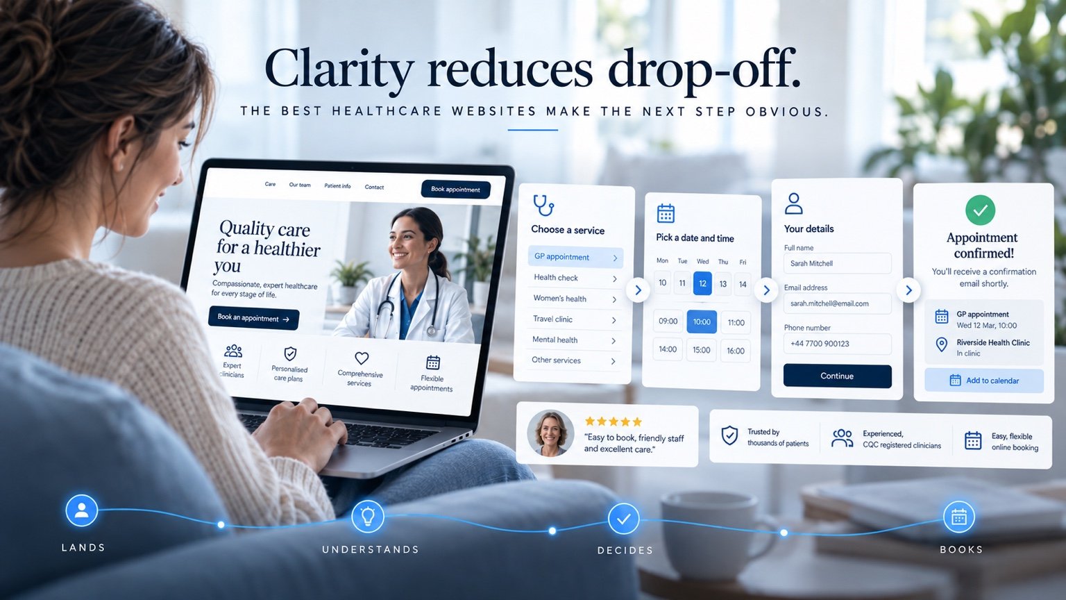
After pressing a button, the patient should know what actually happened. Was an enquiry received, a request sent for review, a deposit taken or an appointment confirmed? Those states must not be presented as interchangeable.
The NHS confirmation-page pattern recommends clearly confirming the completed task and explaining what happens next. Depending on the service, useful details include the date, time, location, contact route and any further action required.
Confirmation messages, approved preparation instructions, reminders and rescheduling information should agree with the on-screen result. Connect the business side too: somebody must own the enquiry, receive the necessary information and handle exceptions. Automation can support that handoff, but it needs clear responsibilities and a recoverable process when something fails.
10. Measure where patients actually struggle
A low enquiry count does not, by itself, prove the design is wrong. Traffic may be small, visitors may be researching or the wrong audience may be arriving. Start with measurement before assumptions.
Define distinct events for service views, booking starts, completed enquiries and confirmed bookings where technically measurable. A CTA click is not a completed consultation request. Check that successful-form events fire after success, and avoid counting the same completion repeatedly.
Compare mobile and desktop behaviour, form completion and the stages before a booking exit. Behaviour tools may highlight repeated clicks or confusing layouts, but they do not explain motivation or establish a patient’s identity. Combine patterns with voluntary feedback and staff observations.
Protect privacy by design. The ICO identifies health information as special category data. Keep names, clinical answers, free-text enquiries and payment information out of analytics events and recordings. Review masking, collection settings, lawful use and relevant consent requirements before deployment; do not assume a tool’s default configuration is suitable for a healthcare journey.
11. Improve the existing site or rebuild it?
Improve the existing website when its structure is sound, service content is useful and the technical foundation works. If the main difficulty is one unclear service page, an excessive form or a poorly explained booking handoff, address that specific point and measure the result.
A rebuild deserves consideration when navigation is fundamentally confusing, mobile tasks are difficult throughout, integrations cannot work appropriately or the content structure no longer reflects the organisation. Compare the cost and risk of maintaining the current implementation with replacement, including migration, staff training and ongoing support.
Rebuilding is a business decision, not the default response to disappointing enquiries. Our guide to website redesign versus a new website offers a practical way to frame that choice. Agree what improvement would look like before choosing the technical solution.
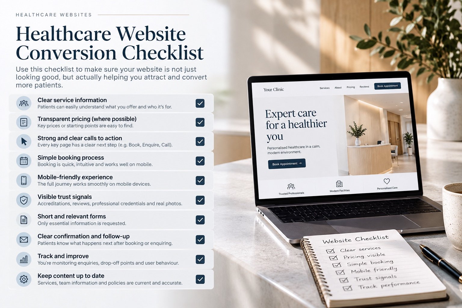
Healthcare Website Conversion Checklist
Use this as a review of the complete route, not simply a homepage design score:
- Service clarity: people can identify the service and understand who it is for.
- Pricing: fees, starting points or the assessment process are explained where appropriate.
- Calls to action: wording matches the next step.
- Booking: availability, requests and confirmations are unambiguous.
- Mobile usability: reading, forms and appointment selection work comfortably.
- Trust: genuine clinician, provider and contact information is easy to check.
- Forms: questions have a purpose and optional information is clearly identified.
- Follow-up: patients and staff know what happens after submission.
- Measurement: completed actions are distinguished from clicks and reviewed with appropriate privacy controls.
- Current content: services, team details, fees and contact information stay accurate.
Remove uncertainty at every stage
The strongest healthcare websites do more than look professional. They remove uncertainty at every stage of the patient journey, while respecting clinical suitability, accessibility and privacy.
Start with a real task, identify where the route becomes unclear and improve that part of the experience. Sometimes the change is better copy; sometimes it is a booking integration, an appropriate payment step or a clearer internal workflow. Our approach to healthcare websites and connected digital systems brings those decisions together around how the service actually operates.
Discuss your patient journey
Improving a healthcare website or patient journey? AL Digital can help you review the website, booking experience and connected digital journey around how your service actually operates.
Discuss Your ProjectPublished 16 October 2026. Sources linked in this guide were reviewed on that date. This article discusses digital experience and service design, rather than individual clinical advice.